February 4, 2012

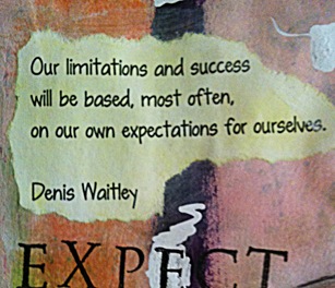
More on Self Imposed Limitations


Jan-23-2012-web

Jan-23-2012c

Jan-23-2012b

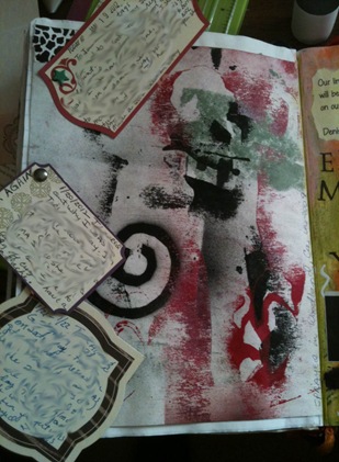
This is from the previous day.  The page background is made of stencil prints. That is, the paint left over on the stencil which I turned onto a blank page then lifted--> print made. I really liked the print and couldn’t bring myself to write on it. Below is a better view of the print.

JournalJan 19-22-2012b

Here it is with the tags moved out of the way.

JournalJan 19-22-2012

Here is a picture of our little prince…just turned 19 months old. He is getting so big.

Little-Prince-at-19-months-web

January 19, 2012

Limitations

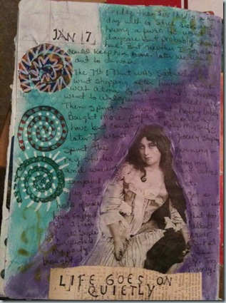
Hello!  My name is Linda and I’m addicted to my computer in general and specifically to Pinterest . That addiction is affecting my art journaling. Or I should say…it’s creating a lack of art journaling.  I’m having fun with it but I finally had to break away to smear some paint on a page. 

I do have to credit Pinterest for allowing me to find the image of this woman. She is so lovely.

Limitations-web

If you’d like to see what interests me, you can find me here: 

http://pinterest.com/justmylittlebit/

January 15, 2012

Pinterest is eating away my time.

I have been so lazy this week and haven’t done much art.  Instead, I joined Pinterest and that is how I wasted my time this past week.  OMG there is so much to see on that site…I LOVE IT!!  It’s introduced me to all sorts of websites that I’d have never found otherwise….but, My oh My,  it’s a time gobbler. I have been on site and the various blogs that it links to for HOURS and HOURS and the bad thing is that I haven’t even made it past the DYI and Craft category. Yikes!  But all was not lost, I did learn how to make laundry soap, dishwashing soap and liquid hand soap…Whoo Hooo,  Boy are we ever going to be clean around here. hehe

Anyone else having a hard time staying away from Pinterest?  If you have never been there, you are in for a treat! Click the link above and you’ll see why I’ve been enthralled.  If you decide you’d like to join, let me know and I’ll send you an invite.

So I got to feeling bad that I hadn’t posted recently so here are some of the art journal pages I worked on last week. Nothing spectacular unfortunately:

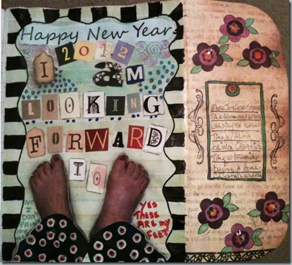
The page below is my Jan 1st, 2012 spread. The section on the right is actually a flap that I added to the page and it lists just a few of the things I’m looking forward to in the coming year.
NewYear2012-web

With the flap folded, you can see my word for 2012….Joy. Our family has had enough stress to last us a lifetime. What we need is more JOY.

Joy2012word-web

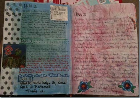
Nothing special here, just some daily entries.
Jan-2-5-2012-web

Jan7-2012-web

One thing I did learn is that composition notebook paper doesn’t take paint/gesso well.  I may have to resort to using my chalk pastels if I want color.

January 3, 2012

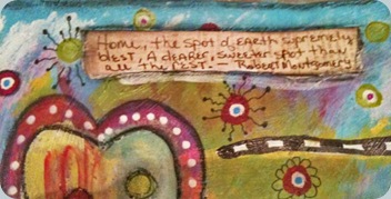
Home


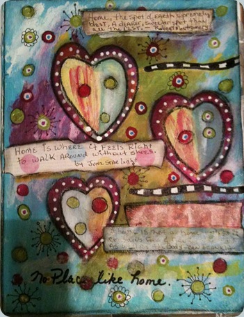
Another page for the Traveling Art Journal group.  This page is for Sarah, whose theme was “Home”.  Trav4SarahCooper

Trav2SarahCooper

Trav1SarahCooper

Trav3SarahCooper

The quote not shown was “A house is not a home until it contains food & fire for the mind as well as the body. ~~ Ben Franklin

December 23, 2011

Handmade gift tags

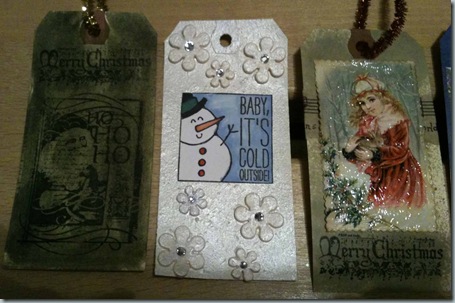
In the last few days I’ve been working on some gift tags (14-15 so far). Nothing as fancy as the ones I made last year but I’ve had fun with them and that’s what counts.  I don’t really have time to show them all but here are a few.

G-tags

I had to use the naughty or nice stamp for the picture on the left because my G was pretending to eat dry leaves (this past fall). We made a game of it where he’d put the leaves in his mouth and I’d pull them out and say no no no! and we’d laugh as if it was the funniest thing on earth.

On the right is a more current picture of G with his Santa hat on…..Luckily I managed to take a picture because he only keeps the hat on for 10 seconds before he rips it off his head.

The rest are a little less personal but as I said before, I’m having fun with them. The “To” and “From” go on the back. 

Tags2

I also made all of my Christmas cards this year. Forgot to take pictures of them before I mailed them out.  But alas, no hand made gifts this year.  No time.

Well, this may be my last post of the year so I’ll say:

I hope you all have a very

Merry Christmas

and a

Prosperous New Year.

See you in 2012!

December 12, 2011

Recycle old Christmas cards

I thought I’d share a link to a cool tutorial named “Making Boxes Out of Christmas Cards”  The boxes are great for gift cards, jewelry, or anything that fits into a small slim box, etc…You can find it here:

Making Boxes Out of Christmas Cards

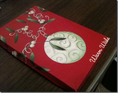
It’s very easy to do. Take a look at the one I made from recycled Christmas card from last year.  Because the card was a used card, it had writing on the inside. I covered it up with scrapbook paper as suggested in the tutorial. Made the box look very elegant.

Box from Xmas Cards

If you follow the tutorial and use glue, I suggest using tiny clamps to hold the flaps in place until the glue is dry. Otherwise, it was a fun little project.

December 9, 2011

Taking risks

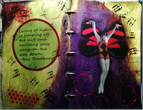
I can’t say I’m much of a risk taker. I tend to play it safe a lot of the time. To this day I still kick myself for not investing in AOL when I knew I should.  That was back in the mid 1990’s.  I knew it would take off and make stockholders a tidy sum….did I listen to my own advice?…Nooooo. 

Not sure how risky it was to choose this color scheme….Yellow green, Purple and Red (with a little white and black)…or in the color theory terms…a split complementary.  Look at my last post, there is a link to a discussion on color theory.  Anyway, the yellow green isn’t as cool in the picture as it is in person andI think the experiment was successful.

Not sure why I love this shade of green. With the exception of Hunter green, green itself, has never been a favorite color.  I few years back I found a craft paint `in a lovely shade named simply “Pear”.  I used that until it was gone and I could find it no more. Now I use Masters Touch brand acrylic paint called Olive green.  I’ve never seen olives that particular color so I’m renaming it Pear. :)

This journal page is for Karen in the Traveling art journal group.

Risk-web

December 6, 2011

Promise me

Another  journal page for the Traveling Journal group I’m in via Facebook.  This one is for Laura and the theme was Strength and Encouragement.

I used a double complementary color scheme with the colors phthalo blue and violet as the main colors and added orange and yellow as the complementary colors.  Wow that sounds so color snobby. But I confess that I used my color wheel to help me determine what a “double complementary” actually is.

So what is a “double complementary” color scheme? It is two adjacent hues and their respective complementary, which is the color directly opposite it on the wheel.  The complementary color for blue is orange.  And the complementary color for violet is yellow.  Does that sound as dry and boring to you as it did to me? It’s hard for me to write about but to read more on color theory visit: The COLOUR Theory Tutorial

encourage-TRVJrnl-web

Does the quote sound familiar? It was said by Christopher Robin to Winnie the Pooh. I love Pooh Bear.  I wish my grandson did as well because I could watch it over and over.  Have I mentioned that I have Pooh Bear PJ’s?…I got them for Christmas several years back and I still wear them….so comfy.

Thanks for visiting.

December 2, 2011

Potholes in the road

Where has the time gone?  I really wanted to get back to posting more often but life sure is getting in the way. I’ve been working on Christmas cards for the family but nothing I can show.  This year instead of making one card and then making prints, I am making the cards individually.  That’s taking a while but I’m enjoying it.

Here is a journal page I made and it seems apropos.  It ain’t pretty that’s for sure but then some of life’s bumps aren’t pretty either.

Potholes‏

Potholes 2

potholes3

November 9, 2011

Beginning a Junque Journal

Earlier this year wrote a post named 365 Creativity - An Altered Journal Cover about breathing new life into an old composition notebook cover.  While I’m not much of a written journal keeper, (I like visual journals much better), I have managed to fill that one up (almost…I’m within 8 pages of being done.) And because it’s almost filled I need a new one. 

Not long ago I found this cool Youtube video named Junque Journal Introduction by tangie baxter and loved it. It’s a three-parter so if you have time, take a look see. My first journal was strictly a white page written journal.  The new one will be a junque journal and will be more colorful and filled with all the ticket stubs etc…that I get on a regular basis that I keep but just never seem to make it into my art journal. 

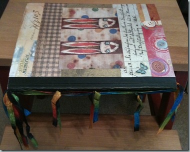
This is the front cover and I adore the rabbits in the center.

CompositionJournal-No2a-web

The back cover:

CompositionJournal-No2b-web

The inside front cover with a tag for my name and address in case it gets lost. I like to take my writing journal to coffee shops and I know one day I’ll probably forget it there. Hopefully someone will be kind enough to return it if it has my name in it.

CompositionJournal-No2c

In the video, Tangie discusses the need for shoring up the binding, which I’ve done here with ribbons.  I love the variegated ribbon shown and have used it many times in other projects….in fact some of it is now holding my steering wheel cover in place….but I digress.  :)

CompositionJournal-No2d

I’ve inked many of the pages but that’s as far as I’ve gotten to date.  I expect it will be an on going process.  I don’t think I will add the tabs shown in the video but you never know. 

Is the idea of a junque journal new to anyone or am I late to the party? either way, I think it will be fun.  My first addition to the book will be the stuff I gather from our upcoming trip to Ojo Caliente.  See you later….I have to go pack a glue stick and some pens. Bye!

LinkWithin

Blog Widget by LinkWithin