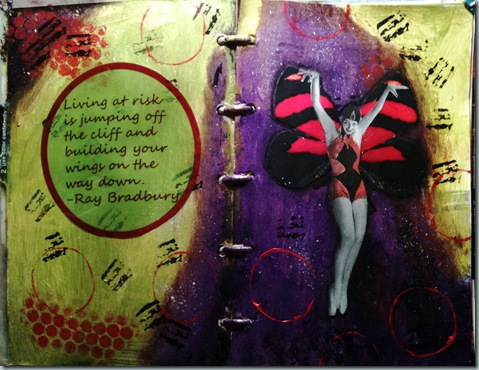
I can’t say I’m much of a risk taker. I tend to play it safe a lot of the time. To this day I still kick myself for not investing in AOL when I knew I should. That was back in the mid 1990’s. I knew it would take off and make stockholders a tidy sum….did I listen to my own advice?…Nooooo.
Not sure how risky it was to choose this color scheme….Yellow green, Purple and Red (with a little white and black)…or in the color theory terms…a split complementary. Look at my last post, there is a link to a discussion on color theory. Anyway, the yellow green isn’t as cool in the picture as it is in person andI think the experiment was successful.
Not sure why I love this shade of green. With the exception of Hunter green, green itself, has never been a favorite color. I few years back I found a craft paint `in a lovely shade named simply “Pear”. I used that until it was gone and I could find it no more. Now I use Masters Touch brand acrylic paint called Olive green. I’ve never seen olives that particular color so I’m renaming it Pear. :)
This journal page is for Karen in the Traveling art journal group.

I think the page looks fabulous! the purples, greens, they all work so well together. I don't like color theory, I know I should learn it, and one day I will, but don't you find that it's more fun sometimes just experimenting?
ReplyDeleteAnother great page from you! I use my color wheels occasionally, but always when I want my colors to be correct or special. It's an indispensable tool. xoxo
ReplyDelete