I recently received "Daily Painting" by Carol Marine to review. I really enjoyed this book, so I’m anxious to tell you about it. This book strives to help artists become more confident and successful by painting one small painting every day. It gives you the benefits of painting small and often, with the objective of selling your art online. The middle chapters include everything that goes along with painting from art supplies to selecting the subject matter and it utilizes artist interviews to get it’s point across in some chapters.
The book indicates that the author paints in oils but with the exception of Chapter 8, the tips included apply to other mediums as well. Chapter 8 does delve more extensively into the use of oils and I have to admit, I initially skimmed chapter 8 looking for information pertaining to the medium I use. But there are portions in chapter 8 that are worth reading even if you do not use oils. However, since reading the book, I have become more interested in trying oils.
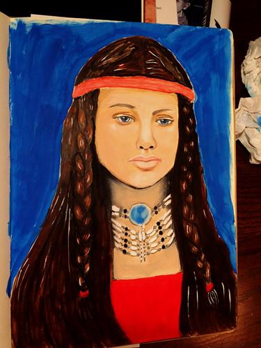
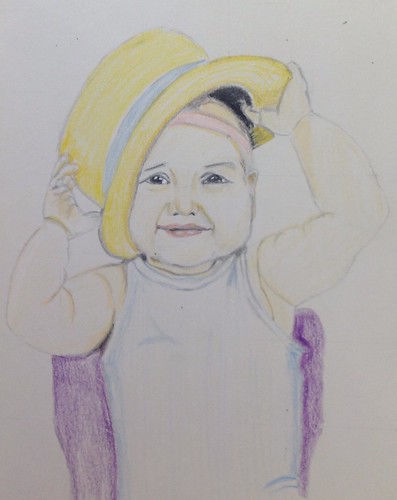
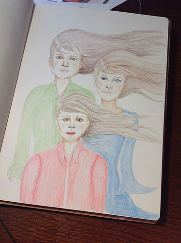
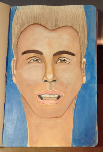
I personally got the most out of chapter 3, which was about selecting a subject matter for your daily painting exercise. Although there are many subjects to choose from, the author chose the following categories to discus: still life and flowers, landscapes, animals, people, cars and buildings, and abstracts. This selection of topics was based on the most common subjects used by other artists on her website, Dailypaintworks.com. While there is no in depth discussion of each subject each one has a brief introduction, an exercise for you to try and includes other artists discussing their reasoning in choosing the subject matter they did. The thing to keep in mind here is that the subject you choose for small paintings might be completely different from what you might paint in your larger studies.
Chapters 4-7 give you invaluable insight on the use of Value, Color mixing, Drawing and proportion, and Composition. For example: in the section on color mixing the author gives you the theory behind mixing colors and then discusses the main reason why some color mixes don’t turn out like you’d hoped, color leaning. About color leaning she says “Unfortunately, the reality of paint is a little bit more complicated than the theory, because there is no pure color in paint! Every color leans toward other colors - in other words, every color has little bits of other color(s) in it.” She gives several examples such as: “cadmium yellow lemon -yellow with the little blue in it, cadmium red medium- red with a little yellow in it.” And goes on to say, “If you want to mix a saturated secondary [color] you have to be careful which colors you use since, if you inadvertently add a third primary [color] to the mix, it will become more gray and less saturated.”
Chapter 7 discusses composition but the gist of the chapter is that it takes time to get the right composition so don’t give up too quickly and listen to your instincts.
Chapter 10 gives you the basics on photographing and editing using photo editing software. Chapter 11 gives tips for better online sales. There are a few benefits I hadn’t thought of such as the use of auctions to help you value your work. However, I wouldn’t buy the book for chapters 10 and 11 as they were too basic and didn’t include very much information not found in many other places online.
Overall, I think this is a good book for amateur painters who wish to delve into the world of the professional artist.
I received this book from the Blogging for Books program in exchange for this review.